

Before & After
Product Design | Brochures | Websites
This is a section I think all designers should have in their portfolios. This allows the viewer to see your skills for a redesign.
This logo redesign was long overdue. When the viewer sees "ABC" in 3 different colors they automatically think "children" but this is a logo for "employee training courses".
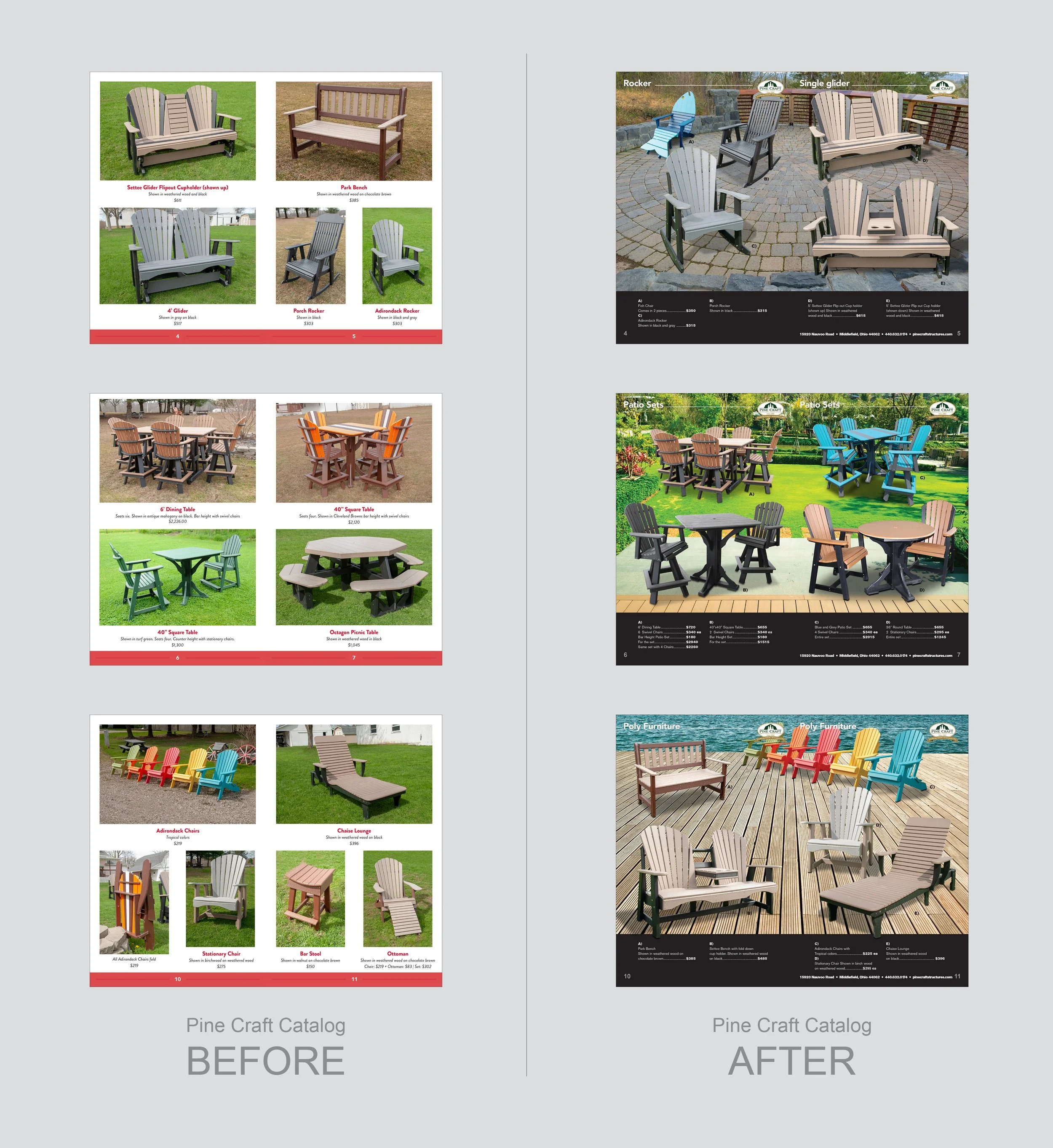
These are 3 spreads from an Amish furniture catalog. I outlined the chair/table photos from the previous catalog— dropped the images into a common background and gave it new life. As you can see some of the photos on the left were shot during the Winter with brown grass and is not very appealing.
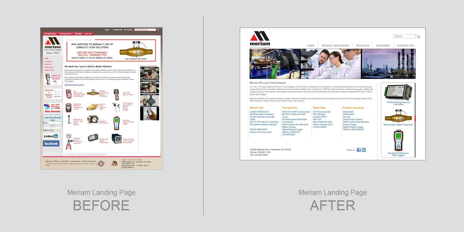
This landing page had a lot going on as well as being unorganized. When designing a website you need to make it as easy as possible to navigate.
A little reorganization and removing color blocks to allow more whitespace makes the layout more elegant.
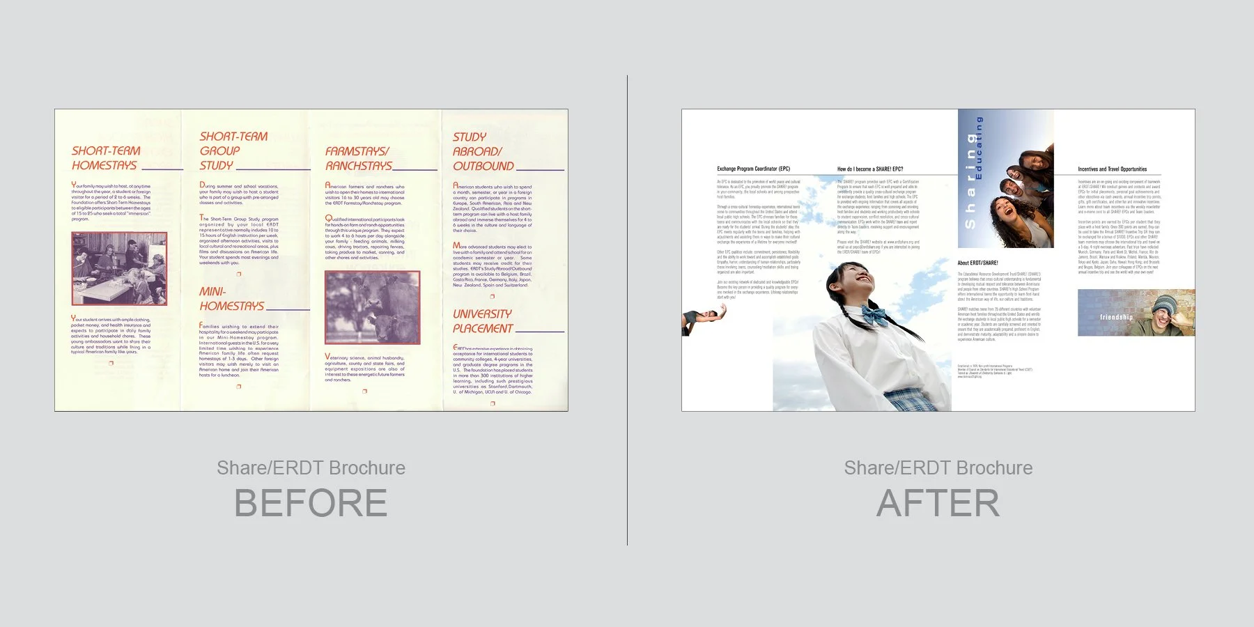
A little color and strong photos gave this 4-panel brochure new life.
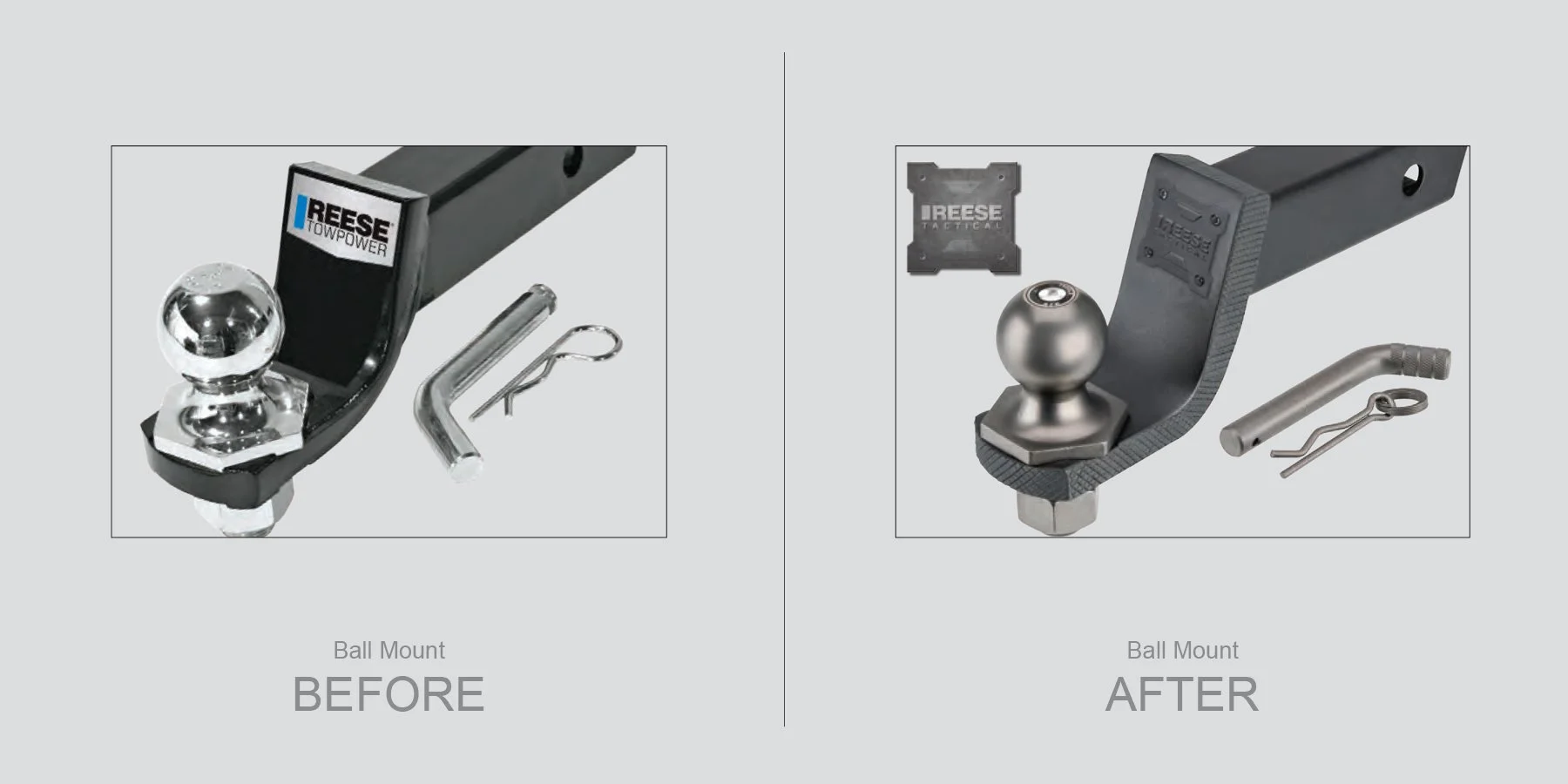
The task was to give this standard ball mount on the left a new trendy facelift. We decided on a Tactical look with a gnarled edge design and mat black/mat pewter color pallet. The new design also has a metal production plate that was held in with rivets.